


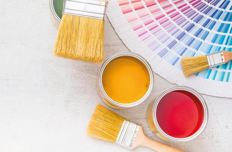
Looking to redecorate? The colours you choose can affect how you feel, as acclaimed interior decorator Michelle Ogundehin explains
More than anything else, the colours that you choose for your home set its mood music. Colour directly impacts your energy levels, and its associated psychology is a subject that has already filled many a tome. In very simple terms, though, colour is emotion. Certain colours can make you feel happy, on edge, calm, quiet, excited or flat and every nuance in between. Clearly they affect different people in different ways, but very broadly speaking we can think of colour in terms of warm versus cool; light versus dark; bright versus dirty. A balanced palette combines aspects of all three of these divisions and the best way to start is by imagining the feeling you wish to create in each room. It will be different according to which room you’re thinking about, and in some cases, for example bathrooms, it might even vary according to the time of day – the contrast between speedy morning teeth-cleaning versus a leisurely evening bubble bath. Just keep jotting down the words or feelings as they strike you – relaxed, energetic, warm, soft – and gradually these will lead you towards certain sections of the colour spectrum. To help, I’ve listed some of the moods that you might wish to conjure and paired them with colours that I associate with each.
Cool

This connotes laid-back spaces, ones that form a backdrop to life. They do not shout, but whisper. Surfaces are smooth, superbly finished and likely to be glossy; bare wood is not part of this vocabulary. Likely to be predominantly white with accents of pale blue or grey but with an undertone of red to offset coldness.
Calm

A softer, more accommodating look. Good for spaces that are intended to wrap around their owners. Natural textures start to creep in, and surfaces range from matt to metallics. Baby blue or pink tones take the edge off cool to give you a feeling of relaxation.
Pale

Gently warmer than cool or calm, and with a greater range of materials, from natural wood to high-gloss lacquers. Here, almost any colour goes but only in their pastel iterations rather than the fully saturated originals. Think ice cream hues: lemon, pistachio or even vanilla mixed with strawberry.
Pretty

This doesn’t have to mean pink, but no other colour radiates such a gentle appeal. The key is to combine it with complementary, yet contrasting colours – think denim blue to add ‘edge’ or sage green to add chic. The pink itself can be dirtied with grey to achieve a gender-neutral effect.
Easy

Suggestive of an environment that soothes and relaxes. As such, associated colours spring from the softer sides of the green and blue families. However, grey and powder pink will prevent the look from becoming too languid, and a dash of turquoise or chartreuse also works. Consider navy as your undertone.
Earthy

Warm, enveloping and comforting, this conjures up the natural tones of elemental materials, in particular wood, balanced by touches of delicate shades of nature, sky blues and leafy greens, underpinned by terracotta, burnt umber, leather brown and pale yellow.
Deep

Good for spaces that require focus. Think crimson, purple, plum, cherry and other berries. Keep it contemporary with dark grey and contrasting complementary colours. Use blue or grey as an undertone to give it weight.
Dark

Dreamy and mysterious, very dark colours can be dynamic. But the way to make it work is to keep it super-textural. Mix all materials and finishes with abandon. And pick undertones with care. Green can be more unusual and striking, blue more inky. Consider warm charcoal grey and navy, too.
Dirty

Similar to pale but instead of being diluted by white, the colours are toned down with grey so they lack hard edges. These colours are intrinsically soothing to the soul.
Watery

Cool and calming, yet also capable of being warm and enveloping, a tricky double act to pull off. Think deep blues and emerald greens through to duckegg blue and jade. The key is a green undertone here, not grey, as otherwise it’ll become too cold.
Warm

Think cosy rather than strident brights, like pale pink, amber and umber, as the fast track to warm without becoming muggy. The use of a wealth of shades from the red end of the spectrum, blushing roses to ruby reds, differentiate it from the earthier look.
Happy

Imagine Crayola colours: bright unadulterated primary shades, unapologetic and straightforward. From Mediterranean sky blue to Mr Happy yellow, these are not for the faint-hearted, but neither are they only for children’s rooms.
For more, read this
Extracted from Happy Inside by Michelle Ogundehin (Ebury Press, £18.99)